55/100
About 74, Good
after fixing the capsule and the screenshots
About 74, Good, after fixing the capsule and the screenshots
Score refined from 67 to 55 after the full check.
10 issues need attention. Fixing the capsule and the screenshots would lift this score the most: an estimated 19 points.
Where 55 sits
The typical page we checked.Circled: your weakest area.
Needs attention · 10
What we saw
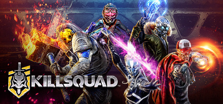
Small capsule 231x87 thumbnail: dark red/brown background, 'KILLSQUAD' text dominates, characters are murky and hard to distinguish at small size
What it costs you
At 231x87 (thumbnail size in wishlists/browse pages), the small capsule is dominated by the word 'KILLSQUAD' logo and a blurry dark-red character collage behind it. There is no readable action, no color-coded enemy vs. hero distinction, and the dark reddish-brown palette blends into Steam's dark theme. A player scrolling a wishlist or search results page in under a second would see a muddy brown rectangle with text, not a hook.
The fix
Simplify the small capsule (upload at 462x174) to a high-contrast single silhouette (one hero mid-action) against a bold, saturated background (electric blue, purple, or orange) so it pops in a scrolling list. Reduce logo size, let the character art carry the read.
Recommendations
- High priority
Reorder detailed description to lead with gameplay, not community links
buyer-journey
Move the Discord and Novarama highlight sections to the very bottom of the detailed description. The first thing a potential buyer reads should be the About the Game pitch and the strongest gameplay trailer, not developer social links. This single reorder recovers the highest-value real estate on the page.
- High priority
Redesign capsules around a single clear action moment
capsule
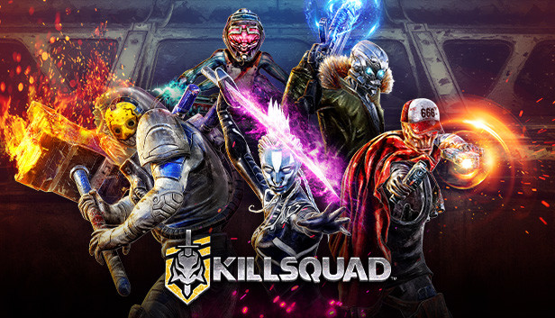
Both header and small capsules currently use a character-lineup composition that reads as generic. Redesign both to feature one hero in a dynamic combat pose against a high-contrast background, with the Killsquad logo smaller and secondary. This will read faster at thumbnail scale and stand out more in browse/wishlist contexts.
- Medium priority
Clarify the 'bounty hunter' fantasy across all page elements
player-fantasy
The short description's strongest unique hook is 'bounty hunter' framing ('Wake up, bounty hunter. We have a mission for you.'), but this fantasy is barely reinforced in screenshots or capsule art. Consider adding a screenshot or capsule element that visually reinforces the bounty/contract fantasy (a contract board, a bounty target reveal, or a 'mission complete' reward screen) to tie the narrative hook to visual proof.
- Medium priority
Add a one-line 'who is this for' audience callout
description
Add a short line early in the detailed description like 'If you love Diablo-style loot, Vampire Survivors-style crowds, and couch-friendly co-op chaos, Killsquad is built for you.' This helps genre-blend games (which risk confusing browsers) quickly self-select the right audience instead of relying on players to piece together the genre mashup themselves.
- Medium priority
Diversify environments shown across the gallery
screenshots
Currently the 5 planets mentioned in the description are only partially represented (desert/canyon and ice crystal environments are visible, but 3 more planet types are implied and not shown). Add screenshots from at least 2 more distinct biomes to visually prove the 'five planets' content claim and increase perceived scope and value.
- Low priority
Audit tag order to prioritize core identity tags
tags
Ensure the first 5-6 tags (the ones most visible and weighted by Steam's algorithm) are the most accurate and high-intent: Action, Hack and Slash, Co-op, Twin Stick Shooter, Online Co-Op, Loot. Move niche or secondary tags like 'Procedural Generation' and 'Difficult' lower if they are not core to the experience.
- Medium priority
Leverage the 2,837 recommendations and 73 Metacritic more visibly
marketing
With a positive recommendation count, consider adding a short pull-quote from a reputable review or a 'Overwhelmingly/Very Positive' callout near the top of the detailed description (Steam auto-displays review summary, but reinforcing it in the narrative, e.g. 'Join thousands of bounty hunters already causing chaos together') builds social proof during the read.
- High priority
Revive development momentum with a visible content or event cadence
launch-strategy
The last news post was in Nov 2023 (Steam Deck support). For a live co-op game with monetization-relevant loot systems, long gaps between news posts signal to browsing players that the game may be abandoned, which hurts co-op games specifically since a dead playerbase means no one to play with. Even small update posts, roadmap teasers, or seasonal event reminders help maintain buyer confidence.
- Low priority
Add a screenshot or GIF-style capsule teaser showing boss scale
screenshots
Screenshot 4 ('Ib'hu, The Profane') is a strong dramatic character reveal shot that stands out from the rest of the gallery. Consider using a similar large-scale boss money-shot earlier in the gallery order (2nd or 3rd slot) since epic boss fights are a stated pillar ('15+ bosses will put you to the test') and this type of shot communicates scale and spectacle quickly.
Looking good · 1
Compared with 88 released Action Steam pages
- Trailer4 trailers on the page.4 · median 2
Your capsule where shoppers meet it
Every placement is drawn at Steam's real size. Nothing here is scaled.
616 × 353 px: actual size
Your 7 screenshots, in store order
Steam shows four or five before a shopper has to press an arrow. Most never do.

The first screenshot is not the strongest visual available: it is visually busy with overlapping beam effects, multiple health bars, and small enemies that are hard to parse at a glance, which communicates chaos rather than exciting, readable combat.


Genre coherence
Mixed signalsShoppers get mixed signals about what kind of game this is, and parts of the page contradict each other in 2 places.
The player fantasy your page sells
You are a sci-fi bounty hunter teaming up with friends to blast and slash through alien hordes and towering bosses while building a stronger character with loot and skills.
What contradicts what
capsule vs description: The capsule's character lineup composition reads as generic fantasy/action ensemble art, while the description explicitly sells a 'sci-fi bounty hunter' premise with twin-stick shooter and bullet hell elements. The capsule doesn't visually communicate the sci-fi setting or fast-paced shooter action the text promises.
screenshots vs tags: The 'Bullet Hell' tag suggests dense projectile-dodging gameplay, but the screenshots primarily show melee-adjacent action-RPG combat with occasional telegraphed AoE zones rather than the dense bullet patterns associated with the bullet hell sub-genre, which may set a slightly mismatched expectation for genre purists.
What players will expect
A player would expect a fast, chaotic co-op action-RPG with sci-fi bounty hunter theming, loot-based progression, and boss fights, similar to a blend of Diablo-style loot and twin-stick shooter action. Based on the screenshots and description, the game appears to largely deliver on this (visible loot UI, varied bosses, co-op HUD elements), though the chaotic first screenshot and generic capsule art may undersell how polished the actual combat and visual spectacle are.
Buyer journey
Breaks at the endYour description has a hook, a promise and proof, but no call to action.
- 01WorksHook
- 02WorksPromise
- 03WorksProof
- 04MissingCall to action
Where it breaks
The opening of the detailed description (Discord and Novarama highlight headers with no content) immediately after the short description, before the About the Game section even begins
What works
- Works: Hero class and build variety explanation ('five hero classes... combine melee and ranged characters')
- Works: Boss and enemy variety description ('More than 15 bosses will put you to the test')
- Works: Co-op flexibility detail (join mid-mission in real time)
What's missing
- Missing: Clear 'who is this game for' audience framing
- Missing: Replayability/endgame content summary
- Missing: Explicit call to action (wishlist/buy prompt)
Short description
Now
“Hack and slash? Check. Twin-stick-shooter? Check.”
Rewrite
“Killsquad is a sci-fi hack-and-slash twin-stick shooter: team up with 3 friends, choose your bounty hunter, and tear through hordes of aliens and towering bosses across five hostile planets.”
The checklist gimmick ('Check. Check. Check.') burns the reader's attention on format rather than content. A player skimming genre tags in their head wants to immediately know the premise and fantasy, not read a repeated rhetorical device four times before getting any concrete information about what's unique here.
Suggested structure
Rebuild your About This Game section in this order.
Hook: bounty hunter sci-fi fantasy in one line
About the Game: core gameplay loop and genre blend
Co-op pillar: how multiplayer works, drop-in/drop-out
Progression pillar: classes, loot, talismans, builds
Content pillar: 5 planets, 30+ contracts, 15+ bosses
Replayability: build diversity, endgame, live events
Community links (Discord, socials) at the very end
Screenshot storytelling
4 shots missingYour screenshots leave out 4 kinds of shot shoppers look for.
First screenshot
The first screenshot is not the strongest visual available: it is visually busy with overlapping beam effects, multiple health bars, and small enemies that are hard to parse at a glance, which communicates chaos rather than exciting, readable combat.
The story they tell
The screenshots feel somewhat random rather than telling a clear story. They jump between combat in a canyon, combat in an ice cave, a boss fight, a dramatic boss close-up, a skill tree menu, another combat shot, and a lobby screen, without a clear escalating arc (e.g., starting calm and building to the biggest boss, or grouping by environment/feature).
Shots to add
- Missing shot: A clean, readable 'hero moment' hero shot with minimal UI clutter
- Missing shot: A clear 4-player squad shot showing all teammates fighting together on screen
- Missing shot: Additional planet/biome variety beyond the two environments currently shown
- Missing shot: A loot/reward moment (opening gear, equipping a talisman) to visually reinforce the RPG progression pillar
Development activity
Inactive5 news posts, the last one 740 days ago.
Over two years without a news post is a red flag for a co-op-focused live game, since prospective buyers specifically worry about finding active lobbies and ongoing support. Post at least a brief update addressing current server/matchmaking health, any recent balance changes, or future plans, even if major content development has slowed. Silence reads as abandonment far more than an honest 'we're in maintenance mode but servers are active and here's what's next' post.
Page health
4 of 5 in placeNot on the page yet: a demo.
- YesTrailer
- Not yetDemo
- YesFormatting
- YesEmbedded media
- YesWebsite
- Tag slots
- 20/20
- Screenshots
- 7
- Short description
- 301 chars
- Long description
- 574 words
- Languages
- 10
- Controller
- full
- Reviews
- 2,837
- Metacritic
- 73
Your page, rewritten
Drafts built from your report. Edit them, paste them into Steamworks, and the page update is done.
Short description
190 / 300 characters
Killsquad is a sci-fi hack-and-slash twin-stick shooter: team up with 3 friends, choose your bounty hunter, and tear through hordes of aliens and towering bosses across five hostile planets.
Detailed description structure
1) Hook: bounty hunter sci-fi fantasy in one line. 2) About the Game: core gameplay loop and genre blend. 3) Co-op pillar: how multiplayer works, drop-in/drop-out. 4) Progression pillar: classes, loot, talismans, builds. 5) Content pillar: 5 planets, 30+ contracts, 15+ bosses. 6) Replayability: build diversity, endgame, live events. 7) Community links (Discord, socials) at the very end.
Tags to set
Looter Shooter, Character Customization, Fast-Paced, Crafting, PvE
Reconsider: Bullet Hell, Procedural Generation
Screenshot order
The first screenshot is not the strongest visual available: it is visually busy with overlapping beam effects, multiple health bars, and small enemies that are hard to parse at a glance, which communicates chaos rather than exciting, readable combat.
Add: A clean, readable 'hero moment' hero shot with minimal UI clutter
Add: A clear 4-player squad shot showing all teammates fighting together on screen
Add: Additional planet/biome variety beyond the two environments currently shown
Add: A loot/reward moment (opening gear, equipping a talisman) to visually reinforce the RPG progression pillar
Competitor Comparisonvs 5 similar games
Add more screenshots
Add more trailers
Tag gaps vs. similar games
across 5 similar gamesThese tags are common in your niche but missing on your page. Adding relevant ones helps Steam surface you in the same discovery queues.
- Adventure60% of similar games
- Character Customization60% of similar games
- Dark60% of similar games
- Dark Fantasy60% of similar games
- Fantasy60% of similar games
- MMORPG60% of similar games
- Action-Adventure40% of similar games
- Exploration40% of similar games
- Gore40% of similar games
Tag prevalence across similar games
30 tags ranked by prevalence- Action RPG100%
- Dungeon Crawler100%
- Hack and Slash100%
- Isometric100%
- Loot100%
- Multiplayer100%
- RPG100%
- Action80%
- Co-op80%
- Singleplayer80%
- -Adventure60%
- -Character Customization60%
- -Dark60%
- -Dark Fantasy60%
- -Fantasy60%
- -MMORPG60%
- Online Co-Op60%
- -Action-Adventure40%
- -Exploration40%
- -Gore40%
- Top-Down40%
- -3D20%
- -Arcade20%
- -Atmospheric20%
- -Co-op Campaign20%
- -Colorful20%
- -Crafting20%
- -Cute20%
- -Demons20%
- -Destruction20%
| Game | Tags | Screenshots | Desc Length | Short Desc | Trailers | Platforms | Controller | Demo | Video | Reviews |
|---|---|---|---|---|---|---|---|---|---|---|
 Killsquad Your game | 20 | 7 | 8,050 | 301 | 4 | 1 | Yes | No | Yes | 2,837 |
| 20 | 8 | 5,243 | 43 | 4 | 1 | Yes | No | Yes | 7,851 | |
| 20 | 8 | 5,040 | 286 | 2 | 1 | Yes | No | Yes | 6,113 | |
| 20 | 12 | 6,169 | 292 | 11 | 1 | Yes | No | Yes | 107,039 | |
| 20 | 24 | 7,367 | 253 | 6 | 1 | Yes | No | Yes | 168,436 | |
| 20 | 10 | 7,047 | 149 | 2 | 1 | Yes | No | Yes | 61,246 | |
| Average | 20 | 12.4 | 6,173 | 205 | 5 | 1 | 100% | 0% | 100% | 70,137 |



Come back after you edit
Re-check this page once you have changed it, with one of the 2 re-runs your report includes, and see which issues are gone. The score on its own can move a few points between runs.