
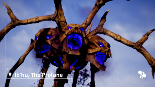
Fix this first · Capsule+10 pts
Small capsule logo-only composition fails at thumbnail scale
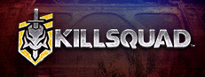
What we saw:
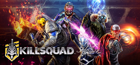
Small capsule 231x87 thumbnail: dark red/brown background, 'KILLSQUAD' text dominates, characters are murky and hard to distinguish at small size
Why it matters:
At 231x87 (thumbnail size in wishlists/browse pages), the small capsule is dominated by the word ‘KILLSQUAD’ logo and a blurry dark-red character collage behind it. There is no readable action, no color-coded enemy vs. hero distinction, and the dark reddish-brown palette blends into Steam’s dark theme.
The fix:
Simplify the small capsule (upload at 462x174) to a high-contrast single silhouette (one hero mid-action) against a bold, saturated background (electric blue, purple, or orange) so it pops in a scrolling list. Reduce logo size, let the character art carry the read.